
Adobe Spectrum
Adobe Spectrum is Adobe’s design system, a shared foundation and language for building experiences across Adobe products and platforms.
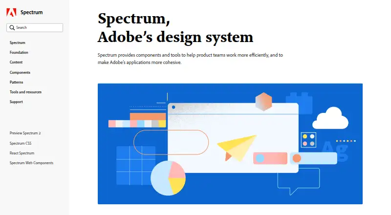
What Adobe Spectrum is
Adobe Spectrum is Adobe’s design system, a shared foundation and language for building experiences across Adobe products and platforms. It provides foundations, reusable tokens, patterns, components, and guidance for consistent, flexible design. Component pages include interactive playgrounds for exploring live components and their properties, using component data connected to Spectrum repositories.
Tokens capture reusable design choices such as color, spacing, typography, motion, and sizing. Spectrum’s color guidance emphasizes accessibility, recommends meeting WCAG contrast minimums, and advises against using color as the only way to communicate meaning. Its typography guidance covers consistent styles and behaviors, with iOS and Android guidance on text scaling with accessibility preferences. Dedicated React and Web Components areas are available in beta; iOS, Android, and other platform areas are described as coming soon. Spectrum Hub provides foundational and implementation guidance, playgrounds, and contact options for feedback, bug reports, and inquiries. The September 2026 release describes the Hub as an initial release, with mobile documentation and unified experience guidance planned for later releases. Spectrum is listed as free and open source.
Good
- Includes foundations, tokens, patterns, and components.
- Interactive playgrounds expose component properties.
- Color guidance addresses accessibility and contrast.
- Listed as free and open source.
Watch out
- React and Web Components areas are in beta.
- iOS and Android platform areas are coming soon.
- Mobile documentation is planned for a future release.
Who it suits
It suits teams building consistent experiences across Adobe products and platforms, particularly those using design tokens, component guidance, and accessibility recommendations. The listed React and Web Components areas are in beta, while mobile documentation remains planned for later releases.
Verdict
Spectrum offers shared design guidance and component exploration, with accessibility considerations built into its color guidance. Its current platform scope is still developing, especially for mobile documentation and implementations.
The facts
Each one read from Adobe Spectrum's own pages, with the date it was checked.
What it does
- Accessibility
- Spectrum’s color system is designed around visual perception, inclusive design, and accessibility.checked 3 Oct 2026
- Accessibility guidance
- Spectrum’s color guidance says its colors are chosen to support accessible experiences and recommends meeting WCAG contrast minimums.checked 3 Oct 2026
- Available implementations
- The site says dedicated React and Web Components areas are available in beta; iOS, Android, and additional platforms are coming soon.checked 3 Oct 2026
- Building blocks
- Spectrum provides foundations, tokens, patterns, and guidance for building consistent, flexible experiences.checked 3 Oct 2026
- Color guidance
- Spectrum advises using its defined colors and providing a label or icon so color is not the only way to communicate meaning.checked 3 Oct 2026
- Component playgrounds
- Component pages include interactive playgrounds for viewing components and exploring their properties and attributes.checked 3 Oct 2026
- Components
- Spectrum component pages include interactive playgrounds for exploring live components and their props and attributes.checked 3 Oct 2026
- Current implementations
- Dedicated areas for React and Web Components are available in beta.checked 3 Oct 2026
- Current scope
- The September 30, 2026 release describes Spectrum Hub as a first release and says mobile documentation and other resources are future additions.checked 3 Oct 2026
- Design data
- Spectrum uses design tokens as reusable design decisions that can adapt to platform requirements while maintaining a shared design language.checked 3 Oct 2026
- Design principles
- Spectrum’s stated principles are rational, human, focused, and collaborative, with an emphasis on inclusivity and accessibility.checked 3 Oct 2026
- Design tokens
- Spectrum tokens represent reusable design decisions such as color, spacing, typography, motion, and sizing.checked 3 Oct 2026
- Documentation connection
- The component playgrounds connect to Spectrum repositories and use real component data in the documentation.checked 3 Oct 2026
- Hub resources
- Spectrum Hub provides foundational guidance, component design and implementation guidance, and live component playgrounds.checked 3 Oct 2026
- Notable limitation
- The September 2026 release notes say mobile documentation and unified experience guidance are planned for future releases.checked 3 Oct 2026
- Purpose
- Spectrum is Adobe’s design system, described as a shared language that brings structure and connection across Adobe products.checked 3 Oct 2026
- Support
- Spectrum Hub offers contact options for feedback, bug reports, and general inquiries.checked 3 Oct 2026
- Typography
- Spectrum typography defines styles and behaviors for consistent typography across products and platforms, and its iOS and Android guidance describes text scaling with accessibility preferences.checked 3 Oct 2026
- What it is
- Spectrum is Adobe’s design system, a shared foundation and language for creating experiences across Adobe products and platforms.checked 3 Oct 2026
- What it provides
- Spectrum includes foundations, tokens, patterns, components, and guidance for building consistent and flexible experiences.checked 3 Oct 2026
Where it runs
- Platforms in progress
- The site says iOS, Android, and additional platforms are coming soon.checked 3 Oct 2026
The full review of Adobe Spectrum
Adobe Spectrum is the shared design system behind Adobe products, offering foundations, reusable design decisions, patterns and component guidance. It is best suited to teams building consistent experiences across products or platforms who can work with its design guidance and beta web implementations. Its current scope makes it a stronger starting point for shared design decisions than a complete mobile implementation resource.
Overview
Spectrum gives teams a common language for shaping flexible, consistent experiences. Its principles—rational, human, focused and collaborative—put inclusive design alongside consistency, so the system is about more than matching appearances. Foundations and patterns provide broader guidance, while tokens and components give teams reusable decisions and building blocks.
That breadth is useful when product teams need to align color, spacing, typography, motion and sizing without treating every interface as a separate design problem. The trade-off is that the system's mobile documentation and unified experience guidance are still planned additions; teams needing complete mobile implementation guidance now should look elsewhere.
Key features
Tokens and components
Spectrum tokens capture reusable design choices, including color, spacing, typography, motion and sizing, and can adapt to platform requirements while preserving a shared language. Component pages add interactive playgrounds for exploring live components and their properties. Because those playgrounds draw on real component data and connect to Spectrum repositories, they make the relationship between documentation and implementation more concrete than static guidance alone.
Accessibility and typography
The color system is designed with visual perception, inclusion and accessibility in mind. Spectrum recommends meeting WCAG contrast minimums, using its defined colors, and pairing color with a label or icon so color is not the only signal. These are practical constraints for teams designing interfaces that need to communicate clearly to more people.
Typography guidance addresses consistent styles and behavior across products and platforms. Its iOS and Android guidance also describes text scaling with accessibility preferences, a useful design consideration even as the broader mobile documentation is still developing.
Implementations and support
Dedicated React and Web Components areas are available in beta, while iOS, Android and additional platform areas are coming soon. Spectrum Hub also offers contact options for feedback, bug reports and general inquiries. The Hub's first release focuses on foundational and component guidance; mobile documentation and unified experience guidance are planned for future releases.
Pricing
Spectrum is free and open source, so teams can use its design-system guidance without a paid plan. There are no paid tiers or plan quotas described. Its license scope is commercial, but the available implementation areas are still in beta and mobile resources remain in progress; free access does not make those gaps disappear.
Platforms
Spectrum is associated with Android, iOS, macOS, web and Windows, and its responsive components are intended to support flexible experiences. In practice, platform scope and implementation availability are not the same: React and Web Components areas are in beta, while iOS, Android and additional platform resources are coming soon. The stated primary asset format is Adobe XD. Teams should distinguish the system's cross-platform design intent from the current depth of platform-specific implementation guidance.
Who it's for
Spectrum is a strong fit for teams that want reusable design decisions, component exploration and accessibility-aware color guidance across Adobe-related experiences. Designers can use its tokens and principles to keep product work coherent; developers can explore component properties and attributes through the live playgrounds and beta web areas.
It is a weaker fit for teams whose immediate need is mature mobile documentation or unified guidance across all target platforms. Those teams may prefer a system with the specific implementation scope they need already available.
Pros and cons
Pros
- Shared design foundation: foundations, tokens, patterns and guidance help teams make consistent decisions across products and platforms.
- Live component exploration: playgrounds use real component data and connect to repositories, making component properties and attributes explorable.
- Accessibility-conscious color guidance: contrast recommendations and the use of labels or icons alongside color give teams concrete practices for clearer communication.
- Free and open source: teams can adopt the system without a paid tier, with commercial license scope.
Cons
- Mobile resources are still developing: iOS and Android documentation and other mobile resources are future additions, limiting its usefulness as a complete mobile implementation reference today.
- Web implementation areas are in beta: React and Web Components guidance is available, but its beta status may not suit teams seeking a settled implementation resource.
- Platform-specific depth is uneven: broad platform association does not mean each platform already has a dedicated implementation area.
Alternatives
For other options, browse UI Kit Libraries.
- Carbon Design System is a free, open-source web design system with no paid tiers stated; choose it when a web-focused system is a better fit.
- Clarity Design System is a free web system under the MIT License, with no paid tiers stated; it is an option for teams seeking that licensing and platform scope.
- GOV.UK Design System offers publicly available code under the MIT license for self-hosted and web use; choose it when that platform scope and public-code model fit the project.
- Material Design for Bootstrap has a free MIT-licensed Core plan for personal and commercial use, plus a Team plan with custom pricing and unlimited projects; choose it if a freemium option with those plan characteristics suits the work.
- Material 3 Design Kit is a free web Figma design kit; choose it when a Figma kit is the needed format.
- MUI is a freemium web alternative; choose it when a web-focused option is preferable.
- Shadcn Studio Figma UI Kit has a free Community plan with limited resources and community support, as well as a one-time Basic plan at $99, paid once; choose it when a Figma UI kit and those plan options suit the project.
- GitHub Primer is another free web design system.
Verdict
Choose Adobe Spectrum if your team needs a free shared design language, reusable tokens, interactive component exploration and accessibility-aware color guidance. Its main advantage is bringing those decisions together; its main reason to look elsewhere is the still-developing mobile and implementation documentation. For teams that need mature platform-specific guidance now, Spectrum is better treated as a foundation than a complete implementation answer.
Alternatives to Adobe Spectrum
- 1
Figma Wireframe Kit
Free planAndroidiOSWebAPI8.0From $3 a month - 2

Ant Design Icons
Free planAndroidiOSWeb7.1Free plan - 3

Shopify
Web7.1From $29 a month - 4

GitHub Primer
Free planOpen sourceWebAPI7.0Free plan - 5

MUI
Free planWeb6.8From $299 a year - 6
Shadcn Studio Figma UI Kit
Free planWeb6.7$99 one-time